‘Symmetry’ a Modern extension in Bromley
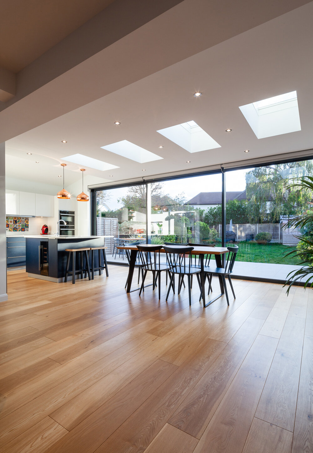
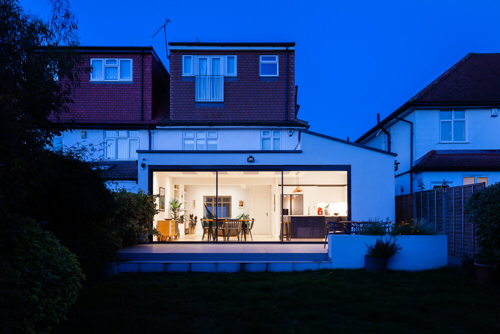
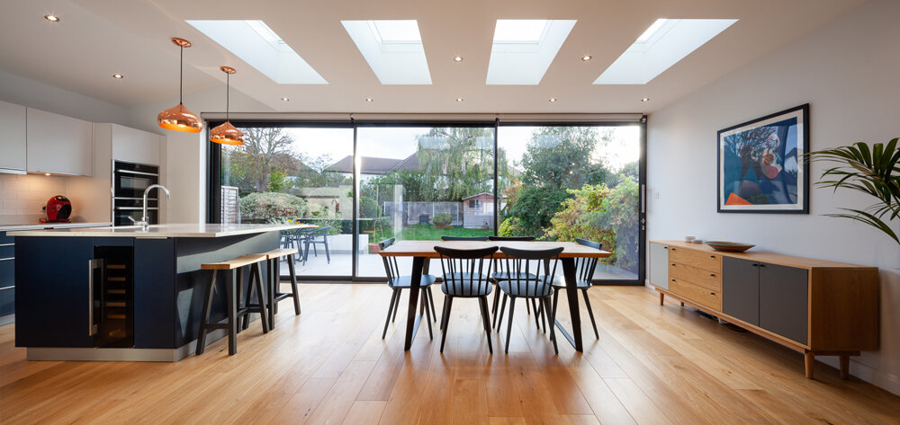
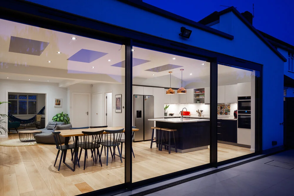
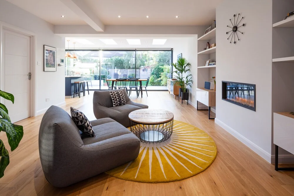
The project in Bromley involved the extension and reconfiguration of an existing semi-detached home. Model Projects collaborated closely with the clients and main contractor to deliver a striking, ultra-modern extension that created a generous open-plan family space seamlessly connected to the rear garden.
Project Type: Renovation and Extension
Location: Bromley, South London
Project Profile: The project included a full wrap around single storey extension, re-configuration to the ground floor layout, refurbishment and new kitchen.
Build Time: 4 months
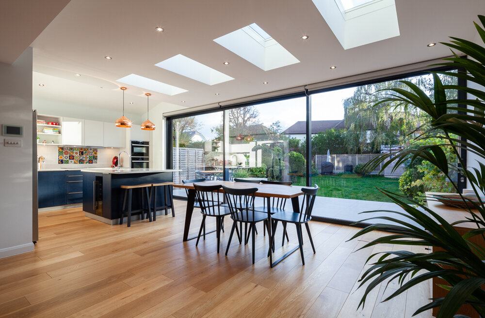
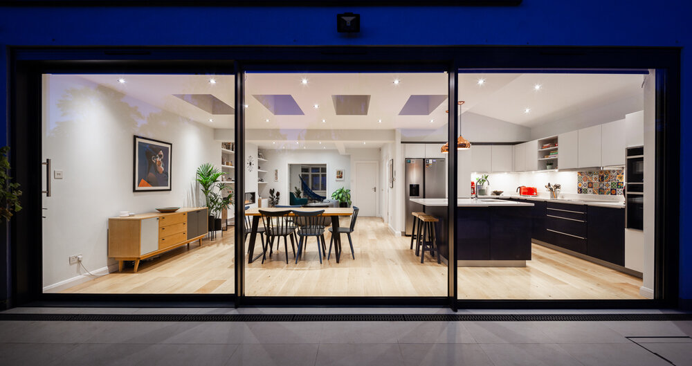
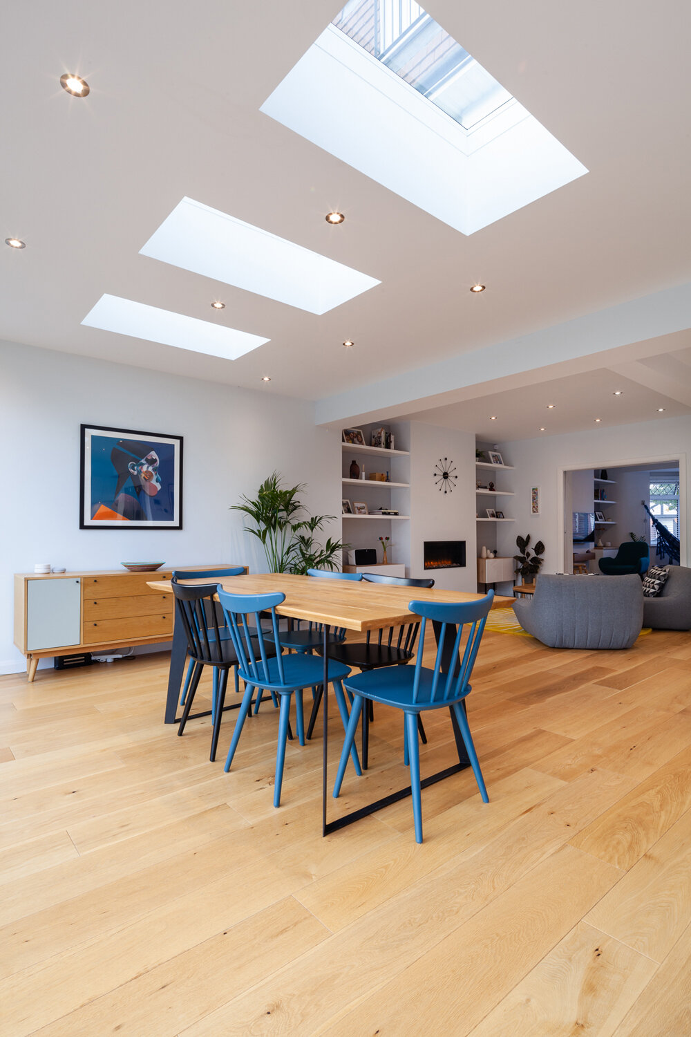
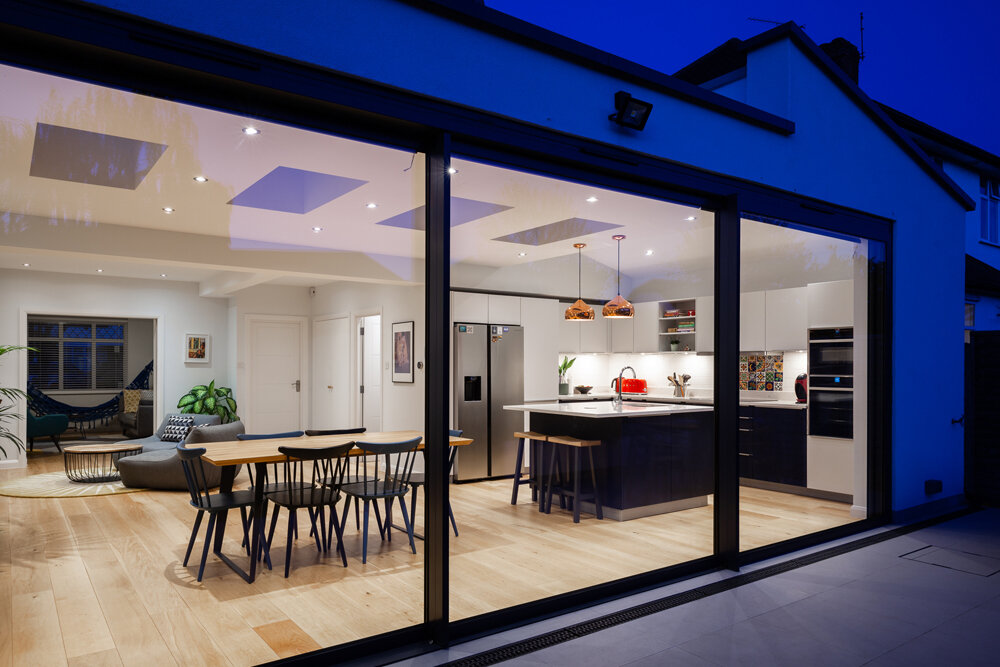
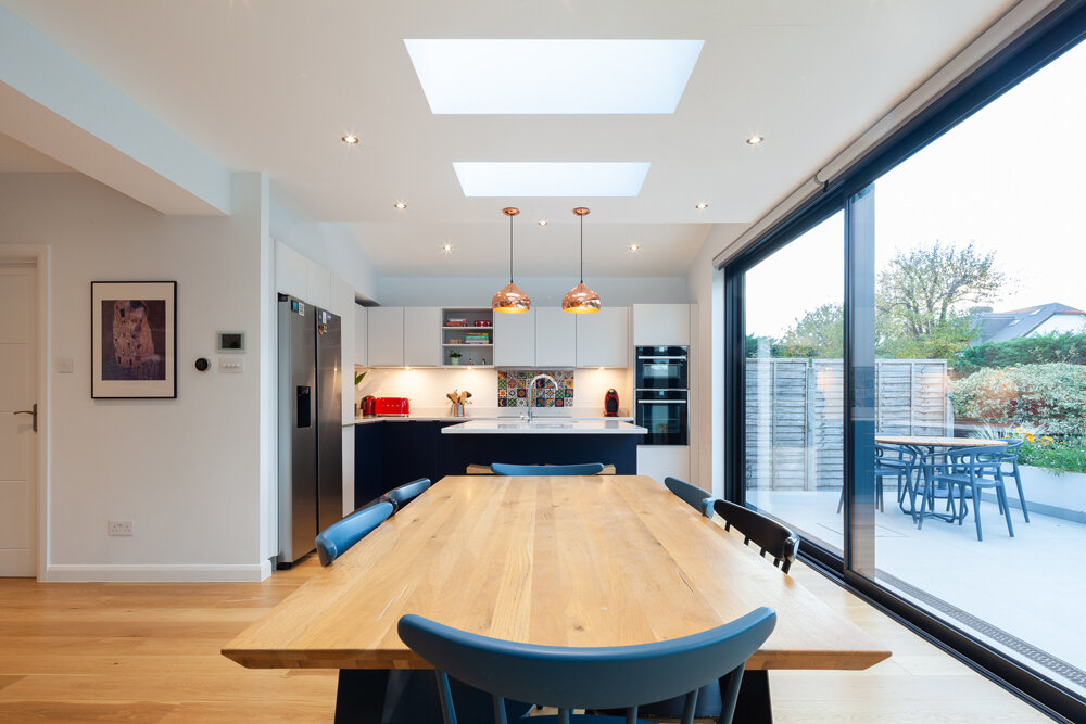
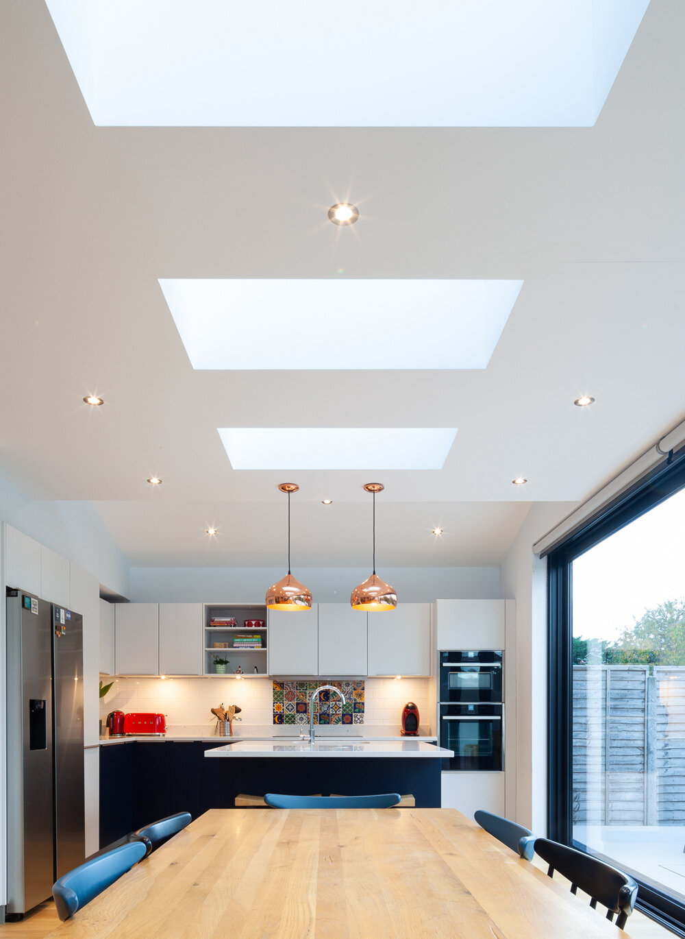
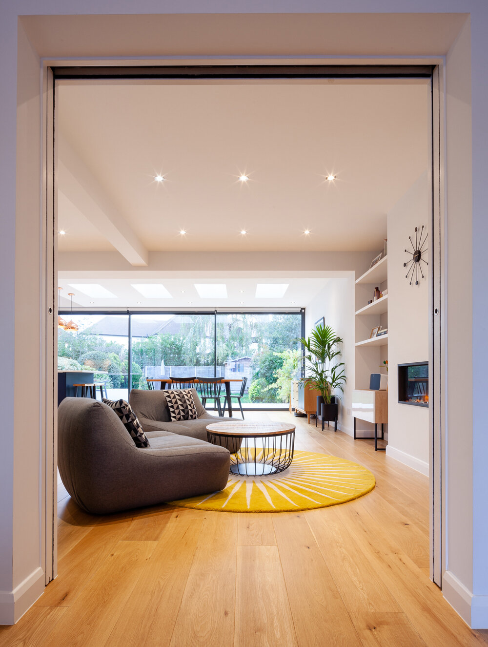
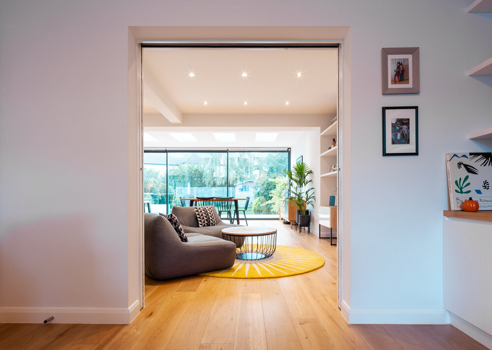
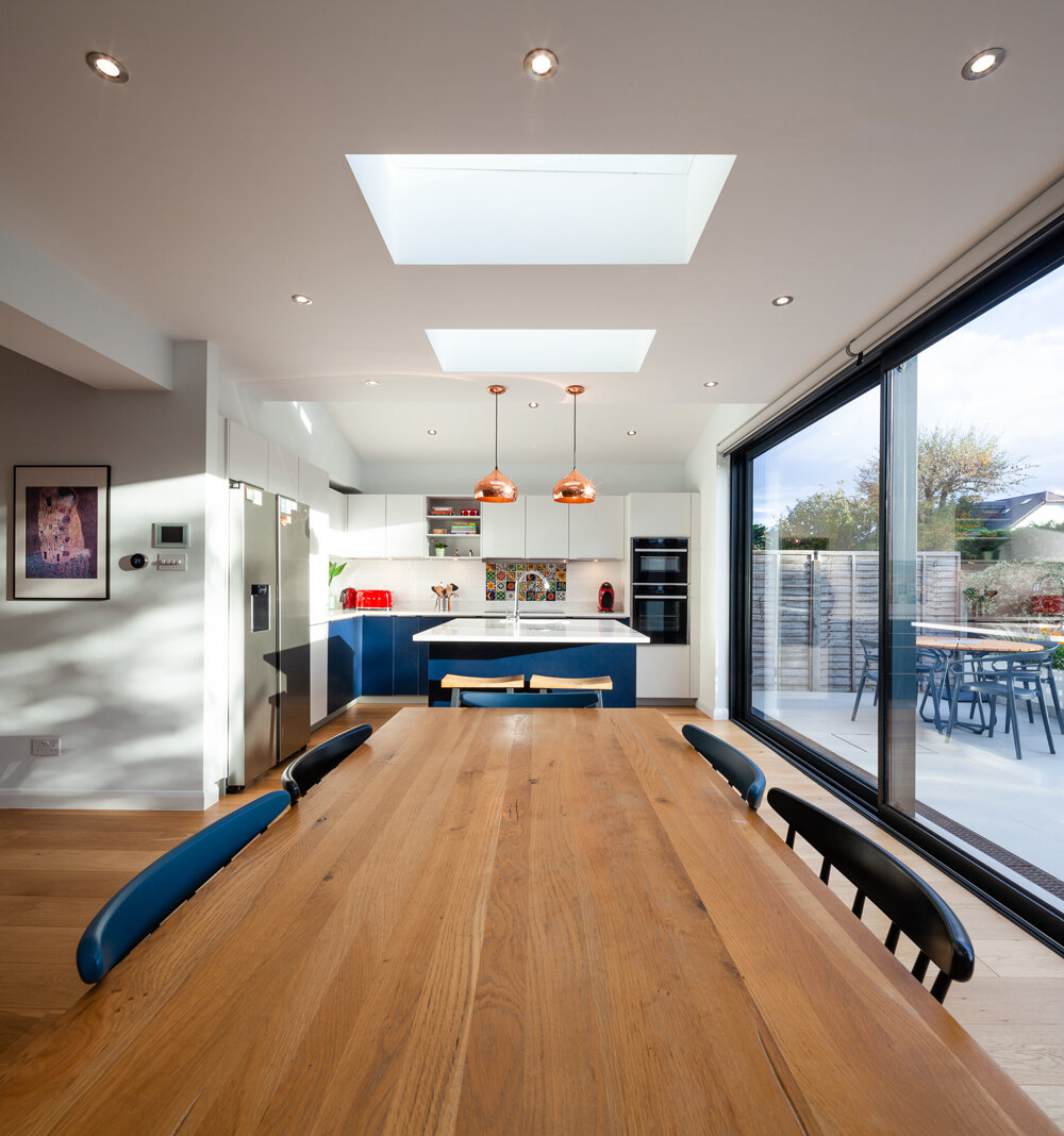
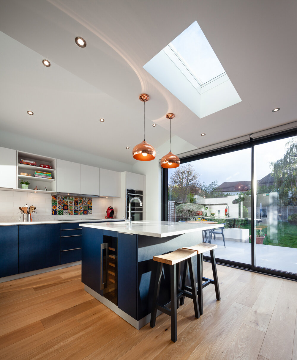
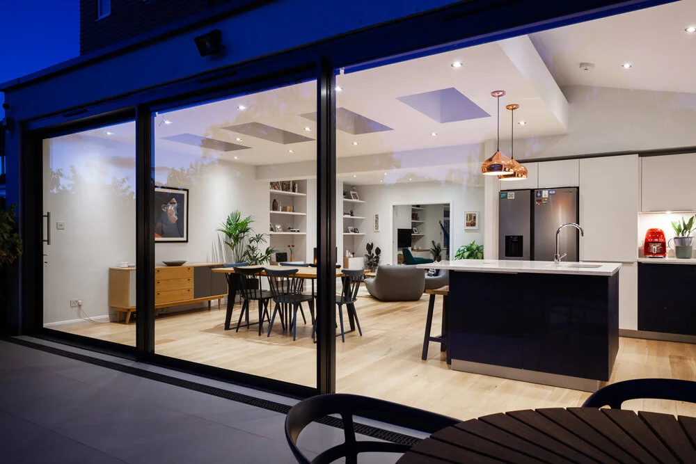
A key feature of the design is the extensive glazing, with large sliding doors and a series of symmetrical rooflights that flood the interior with natural daylight. The result is a clean and contemporary space that enhances everyday family living while maximising the relationship with the outdoors.
Homeowner Brief
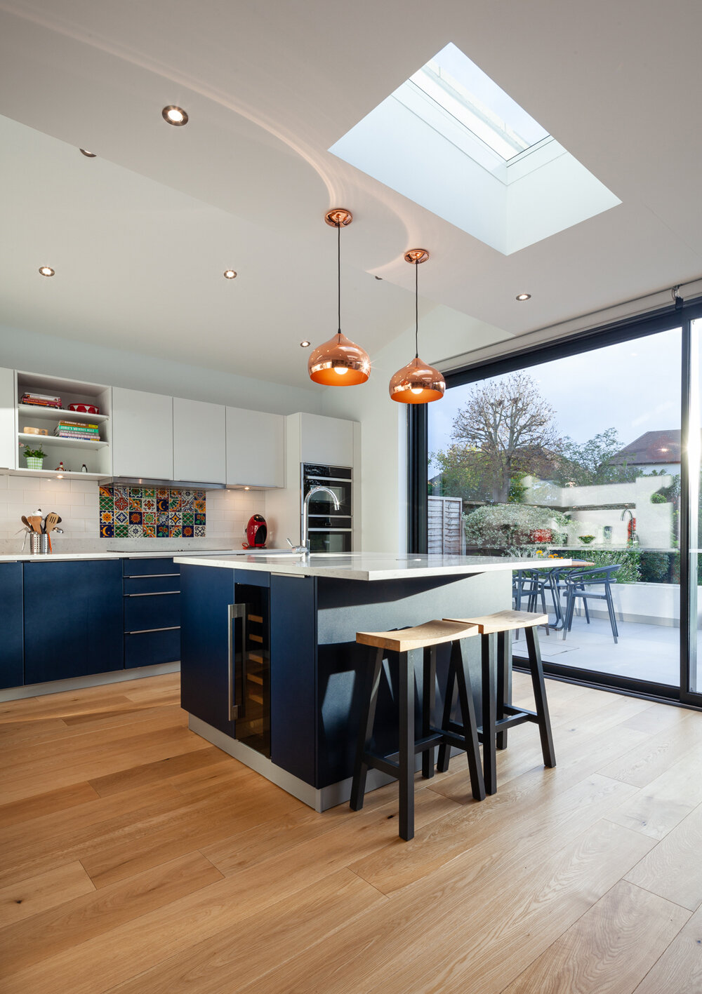
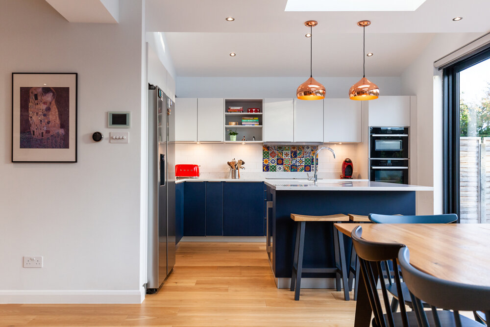
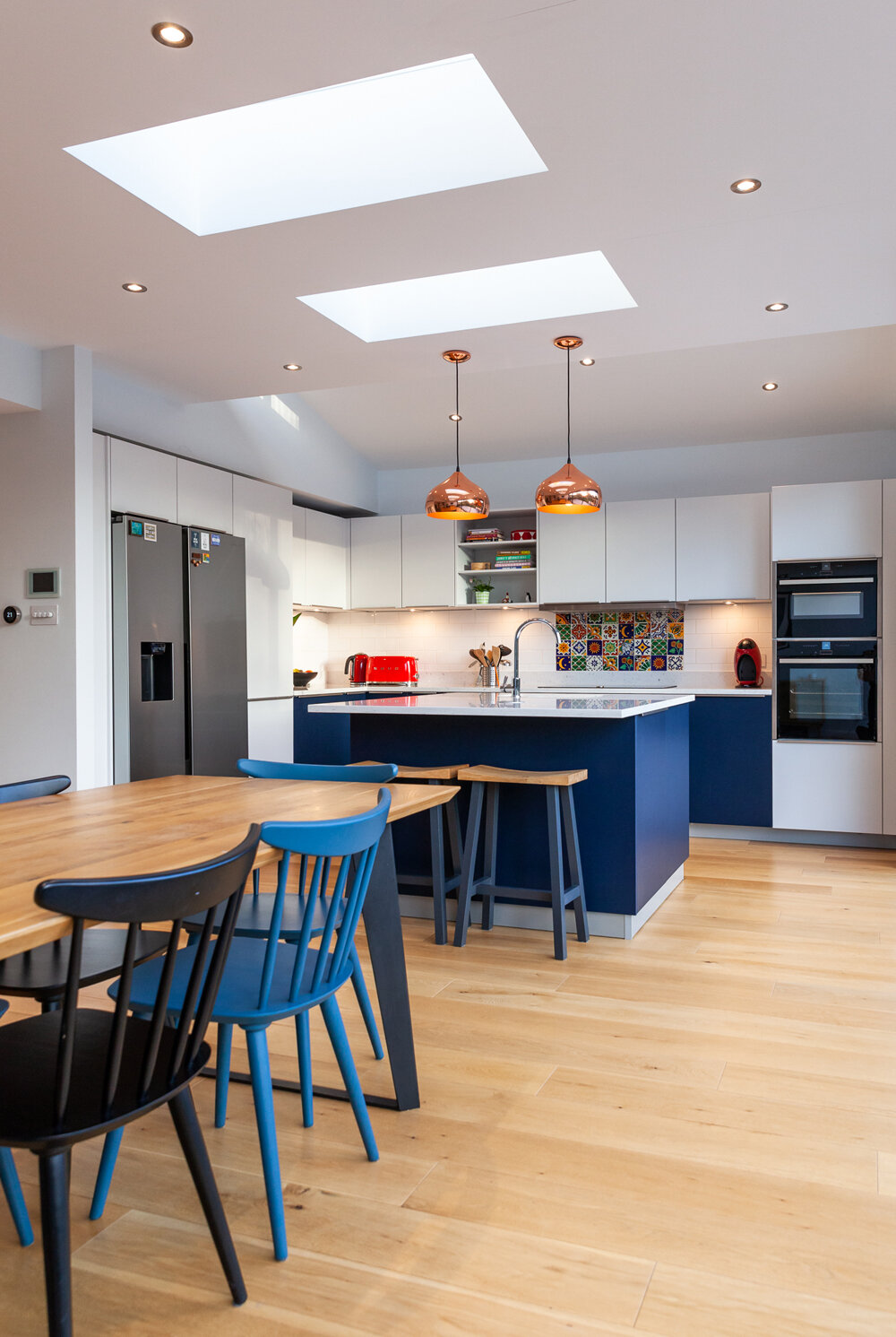
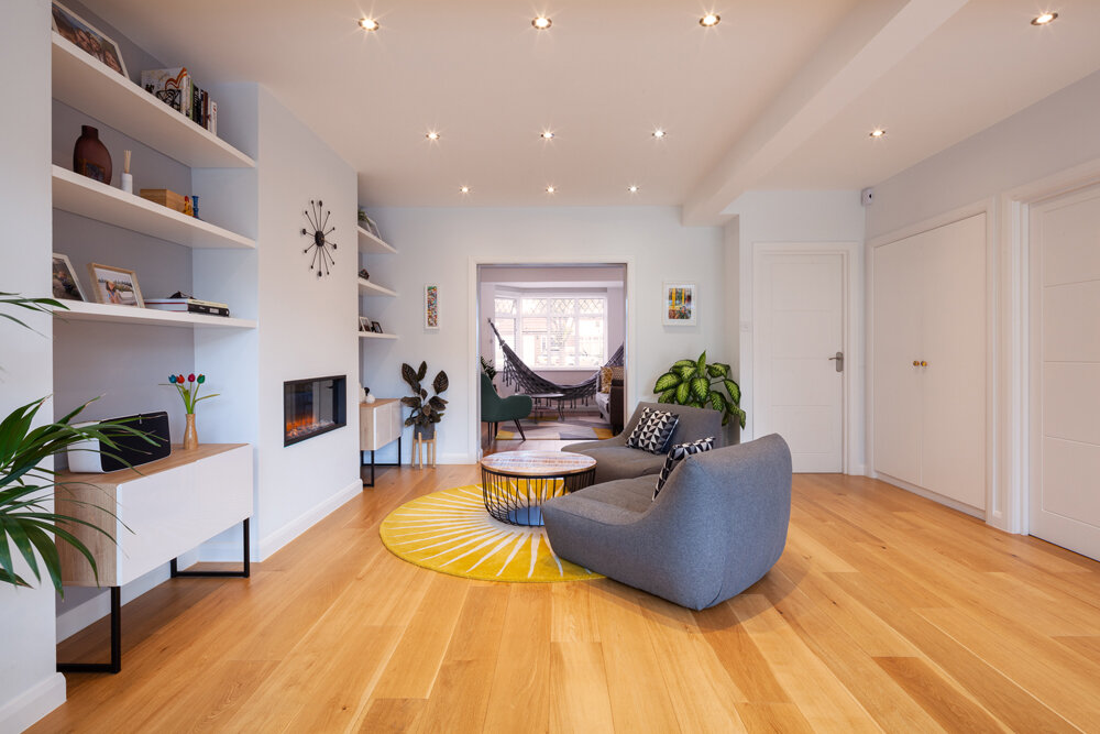
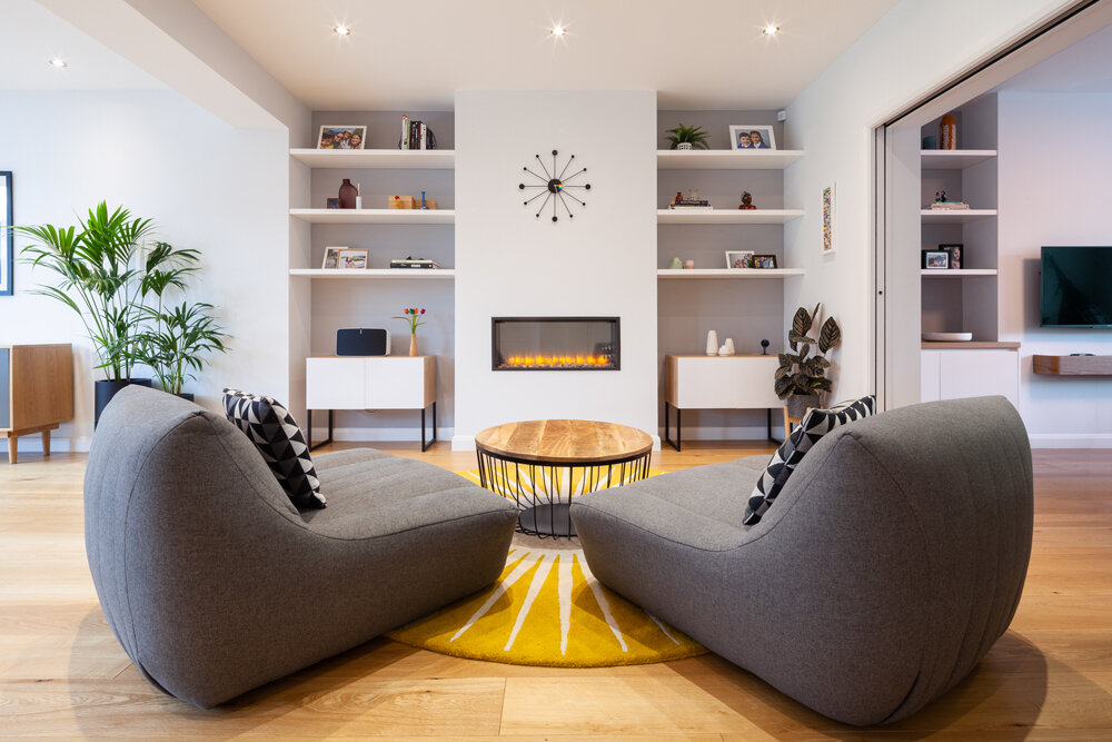
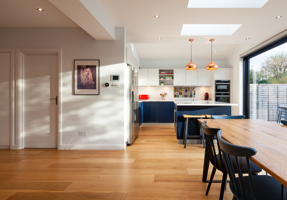
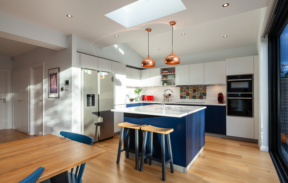
Caroline and Lucas wanted a space that would be flooded with natural light and designed to work effortlessly for their young family. The layout is centred around a generous kitchen, which anchors the open-plan space and creates a natural flow through to the dining and living areas.
Home Profile:
The original property was a 1930s semi-detached house with two main living rooms and a small kitchen. A loft conversion had already been completed prior to this project. The proposed works focused on a single storey extension that wraps around the side and rear of the house, transforming the home’s layout and appearance.
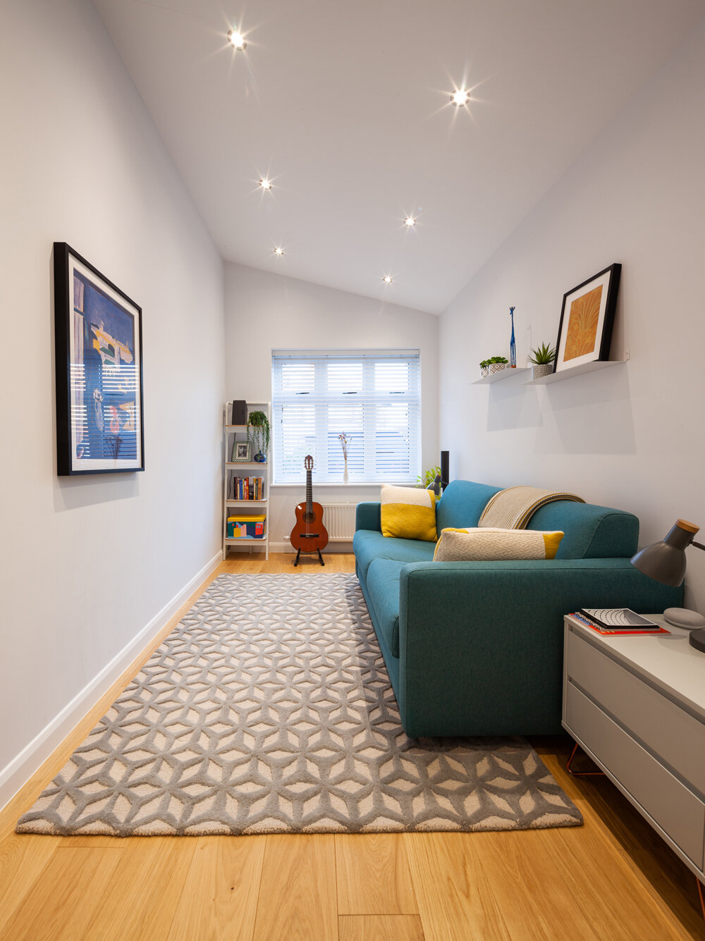
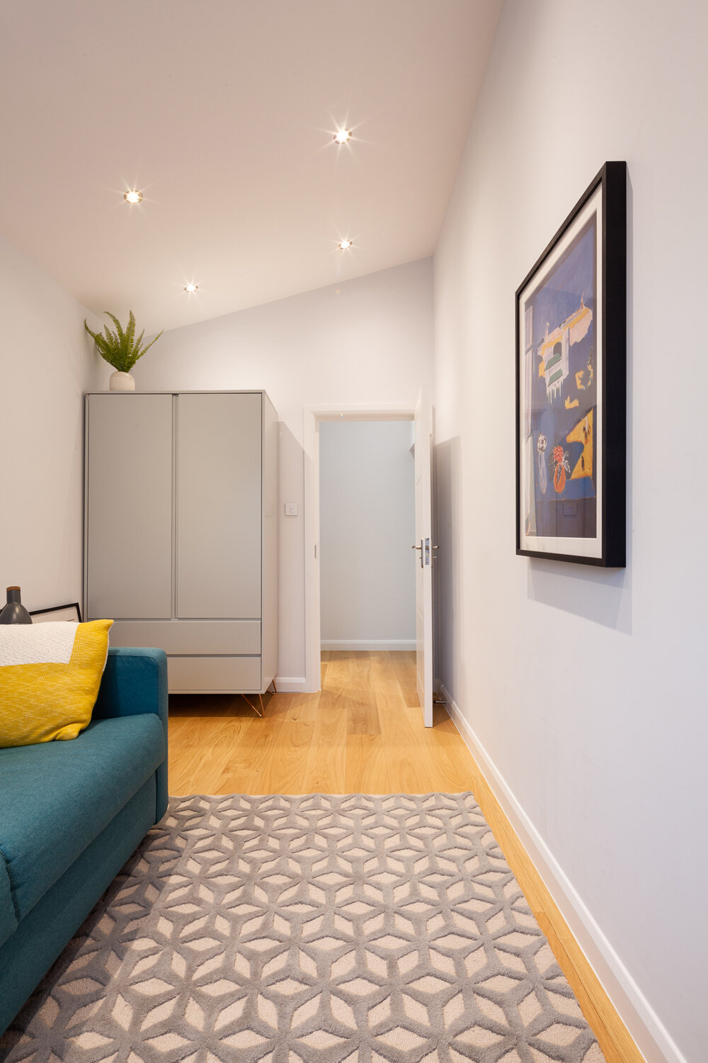
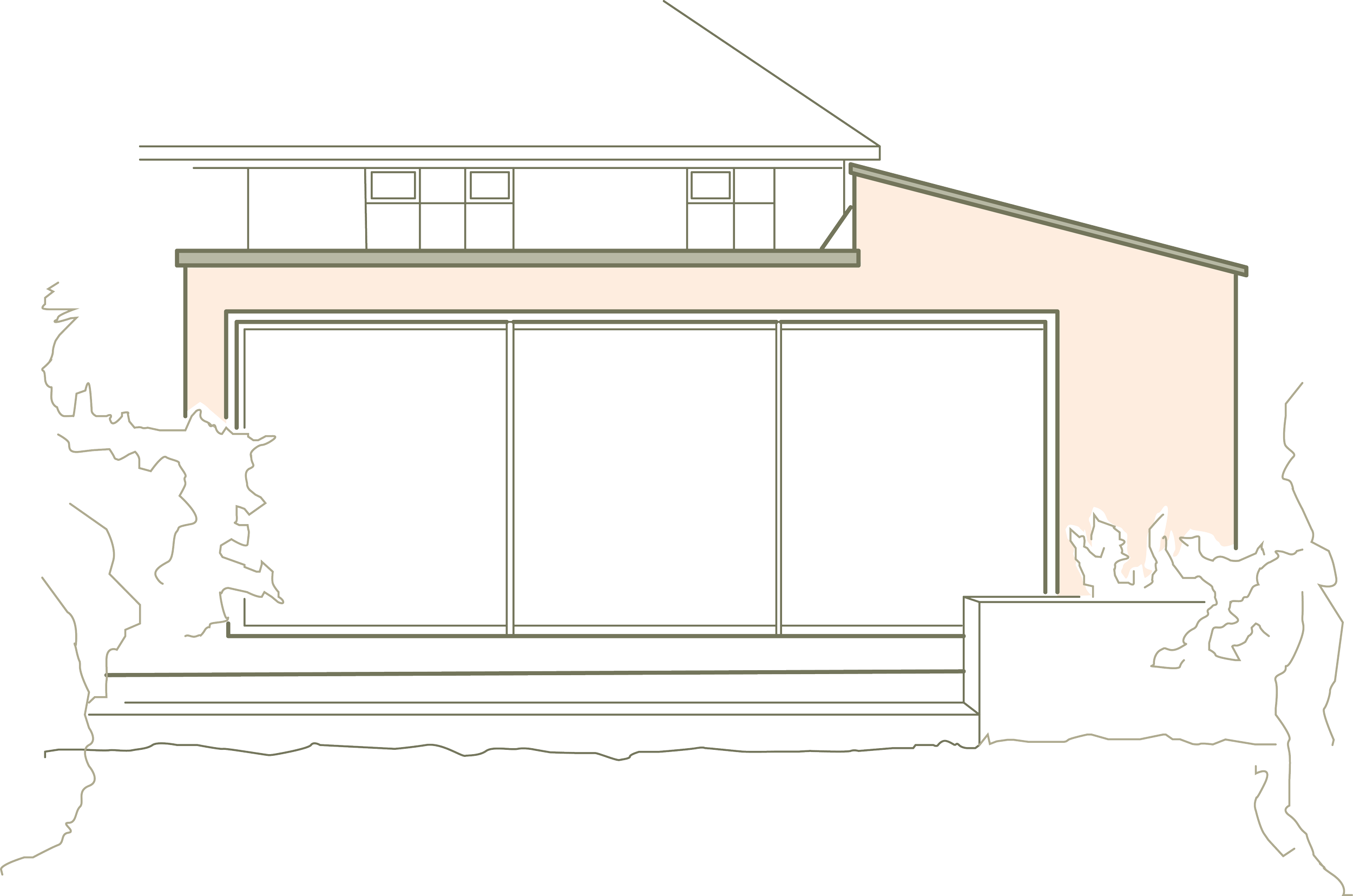
To the front, the extension projects forward to form a new porch entrance and home office. A key design consideration was ensuring the new addition complemented the original character of the house. This was achieved by introducing a pitched roof along the side extension that ties in with the existing roofline and materials.
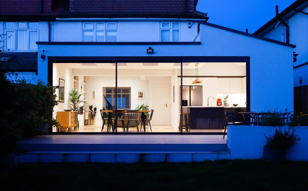
In contrast, the rear extension embraces a bold, ultra-modern aesthetic. A flat roof runs along the rear elevation, seamlessly connecting with the pitched roof to the side. A high-level slit window along the roof junction draws natural light deep into the kitchen, while a series of evenly spaced rooflights and a full-width set of grand sliding doors flood the space with daylight.
The sliding doors open directly onto a new flush-level paved terrace, creating a smooth transition between indoor and outdoor living.
To learn more about this case study or talk about your own porject, please contact us by phone at 020 7095 8833 or via email at hello@modelprojects.co.uk.
Selection of views
Key Design Features
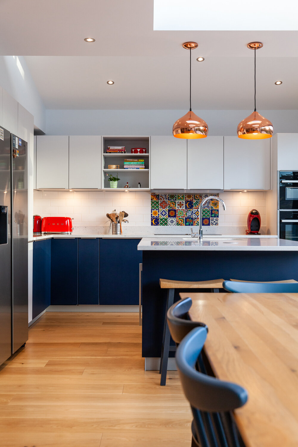
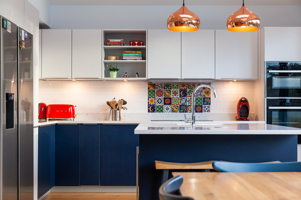
The kitchen has been designed with a modern aesthetic to reflect the contemporary style of the extension. Rich blue base units contrast with sleek gloss white wall units and a crisp white worktop, creating a bold yet balanced look. A splash of colour and texture is introduced through the use of vibrant patterned tiles, adding character and visual interest to the space.
Click Through Gallery
